Logo rescue & brand identity
Your logo probably breaks
somewhere you haven’t looked
Most logos are fine until they meet a dark background, a 16‑pixel browser tab, or a one‑color print job. I test what you already have, show you exactly where it gives out, and rebuild it so it holds.

The free audit
Five things
I check first
Send me your logo. I’ll show you which of these it fails, and the evidence for each. No charge, no obligation to buy the fix.
- 01It vanishes at thumbnail size
- 02You only have a JPG or PNG of it
- 03It uses more than two fonts
- 04It falls apart on anything dark
- 05It looks like your competitor’s
A Logo Rescue — Notes of Nocturne
One mark,
drawn for every use
This was a rescue, not a redesign. The design was already theirs; what they did not have was a file that worked. A logo is not one file either — the label needs different detail from the branding iron, and the browser tab needs different detail again. Every piece below is the same mark, resolved for each thing it actually has to survive.

The other kind of rescue
A generated logo usually arrives as one flat picture with the tone baked in. There is no vector underneath it, so it cannot be recolored, reversed, or printed in one color — and enlarging it just makes the softness bigger. The design is often fine. The file is the problem.

What makes this different
You get the evidence,
not just the files
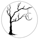
Plenty of people will rebuild a logo. Almost nobody tests the result and shows you. Every job ships with a proof sheet: the mark placed at the sizes and on the grounds it has to survive, so you can see it work instead of taking my word for it.
It is also where the honest answer lives. The full emblem holds down to about 64 pixels. Below that it needs the compact mark, and the sheet says so rather than pretending one file does everything.

16 px

32 px

64 px
128 px
16 px
32 px

64 px
128 px
Two ways to work together
Rescue it, or rebuild it
Most people need the first one. A sound logo that is only badly built is faster and cheaper to fix than to replace.
Both prices are a starting point — the final quote depends on how much is salvageable and how many applications you need. Payment runs in three parts: 50% on signing, 25% when you approve the direction or the first rebuilt proof, and 25% before the final files.
Logo Rescue
From $850 typically one week
You have a logo you like. It came from a generator, a template, or a designer who handed over a JPG and disappeared. I rebuild it properly without changing what you recognize.
- True vector, redrawn and cleaned
- One-color version that actually reverses
- Transparent on any background
- Favicon and avatar set drawn for small sizes
- SVG, PDF, EPS, PNG — print and web
- A proof sheet showing it tested
No concepts. The design is the one you already have — see the Notes of Nocturne rescue above.
Brand Identity
From $2,500 three to four weeks
You don’t have a logo yet, or the one you have is past saving. A mark built from the ground up, plus the system that keeps it consistent once other people start using it.
- Original mark, built as vector from the start
- Every lockup: stacked, horizontal, mark only
- Color palette sampled from the artwork
- Typography, spacing and usage rules
- A brand board you can send to anyone
- The same proof sheet, on every file
Two concepts. You pick one, and everything comes from it.
Before you ask
The questions
everyone asks
All of this is written into the agreement you would sign, so none of it changes once we start.
Do I own it when it is done?
Once the fee is paid in full, the final design and every file listed in your agreement are yours outright, worldwide, with nothing further to pay. Concepts you did not pick stay with me.
What if my logo cannot be saved?
I will tell you that in the audit, before you pay anything. Some marks are past rescuing, and charging you to redraw a bad idea helps neither of us. That is when a Brand Identity is the honest answer.
How many revisions do I get?
Agreed in writing before we start. A round is one list of changes sent at one time, so you are never spending a whole round on a single typo.
Which files do I actually receive?
SVG, PDF, EPS, PNG and JPG as standard. Lettering is converted to outlines, so you never have to install a font, and any printer or future designer can open what you have. My editable source documents (.ai and .psd) stay with me and are not for sale — the SVG and PDF you receive are fully editable vector and are what a printer or a designer needs.
Do you handle the printing?
No. I supply artwork and you keep your own printer or manufacturer. Always get a physical proof before a production run, because screen color never matches ink, fabric or vinyl.
How does payment work?
Three parts: half on signing, a quarter when you approve the direction or the first rebuilt proof, and the last quarter before the final files are delivered. Previews are watermarked until the final payment clears.
Contact
Send me your logo
Attach whatever you have — a screenshot, a photo of a sketch, a file a generator handed you. I’ll tell you what is wrong with it and what a fix would take. If it is already working, you’ll hear that instead.